Services
- Discovery & Immersion
- Brand Strategy
- Foundational Messaging
- Identity Redesign
- Collateral & Sales Materials
- Web Design & Development
- Content & Digital Marketing
Orange Element rebranded Baltimore Equitable Insurance, a homeowners insurance company founded in 1794, and designed and developed a new website and collateral system to support it. The work streamlined the company's historic fire mark, built a foundational messaging framework around six brand themes, and replaced the industry term perpetual insurance with the clearer promise of 100% refundable coverage. In the website’s first four and a half months, organic search delivered its most engaged visitors.
Baltimore Equitable Insurance has provided 100% refundable homeowners insurance since 1794, even before Baltimore was officially recognized as a city. It is one of the oldest insurance companies in the United States, and it stands on a legacy of stability, trust, and distinction. That founding year is now part of the brand itself. The company’s fire mark reads 1794, and the new website lives at 1794insurance.com.
The model has remained the same throughout that history. Annual premiums are an expense a homeowner can never get back. A Baltimore Equitable Insurance policy replaces the premium with a deposit, paid once at the start of coverage and returned in full at cancellation, with no penalties or fees. Rates do not increase after a claim, and the deductible drops to zero after five claims-free years.
The company writes policies for homeowners, condo owners, and renters, and it serves discerning homeowners focused on long-term financial security. The average policyholder stays with Baltimore Equitable Insurance for more than 20 years, and the company has remained financially strong through the Great Baltimore Fire, the Great Depression, and the 2008 financial crisis. Even so, as the company’s own materials put it, it is still a well-kept secret, often shared among family members or between friends.
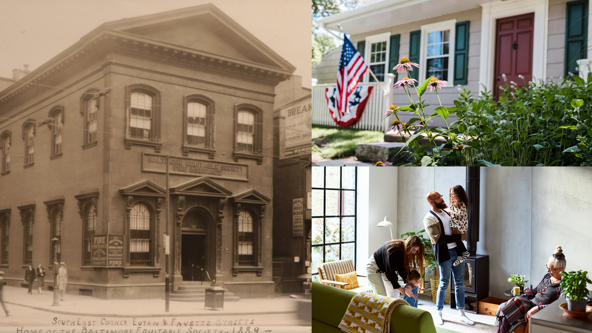
The company’s greatest strength was also its most persistent communication problem. Within the industry, the deposit-based model is known as perpetual insurance, a term that means very little to most consumers. Prospective policyholders did not understand it, mortgage companies asked for a monthly premium figure that did not exist, and a product with clear advantages was often dismissed as complicated, or as too good to be true. The company also had no single, agreed set of messages, so the same product was explained differently depending on who was explaining it.
The brand and the website compounded the issue. Neither reflected the strength and longevity of the institution behind them, and an earlier rebrand attempt had not taken hold. Competing against national carriers with far larger advertising budgets, the company needed a visual identity that could carry more than 230 years of history while still feeling relevant to a modern homeowner, a set of messages the whole company could use consistently, and a website that would turn understanding into quote requests.
The discovery session included nearly the entire Baltimore Equitable Insurance staff, from the CEO to the sales team, and we asked about pain points and points of pride until we understood the company the way its own people did.
The session gave us a clear sense of where to focus, and because everyone had a voice in the room, it built company-wide buy-in that carried through the rest of the project.
Discovery also uncovered the material that would shape the brand. Two centuries in Baltimore came with stories that showed how deeply the company is rooted in its community, and those stories informed both the tone of the messaging and the art direction of the identity.
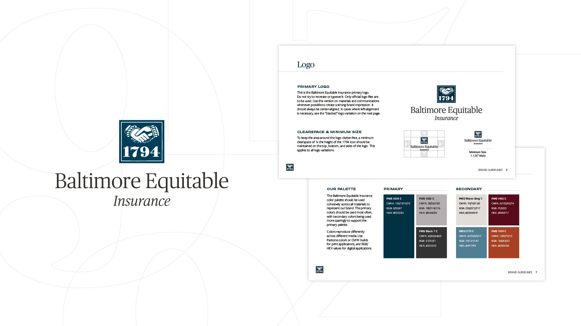
Identity: A brand evolution would typically begin from a blank page. In this case, one element clearly needed to remain: the 1794 fire mark, which has represented the company for generations and is recognized on sight by the people who know it.
We streamlined the mark, honoring its legacy while reintroducing it as the primary symbol of the brand, and paired it with new typography and a refined color palette that feel current without abandoning the company’s history.
The work moved methodically from moodboards to several design concepts, each modernizing the mark in a different way, and then through color and typography studies until the final system was in place.
Messaging: The most significant change was not visual. We retired the term perpetual insurance and built a foundational messaging framework organized around six brand themes: Legacy, 100% Refundable, A Future Opportunity, White-Glove Customer Service, Ease of Cancellation, and Exclusive Partnership. Each theme carries approved language the team can use directly.
The lead promise now explains the model in a sentence: a policy from Baltimore Equitable Insurance provides the same quality coverage as a traditional insurance policy, but every dollar put toward coverage is 100% refundable.
Because a homeowner, a longtime policyholder, and an independent agent each need a different entry point, we wrote the framework in versions for all three, along with a profile of the ideal customer. The result gives everyone at the company the same words for every touchpoint, from the website to a sales conversation to the letter that reassures a mortgage lender.
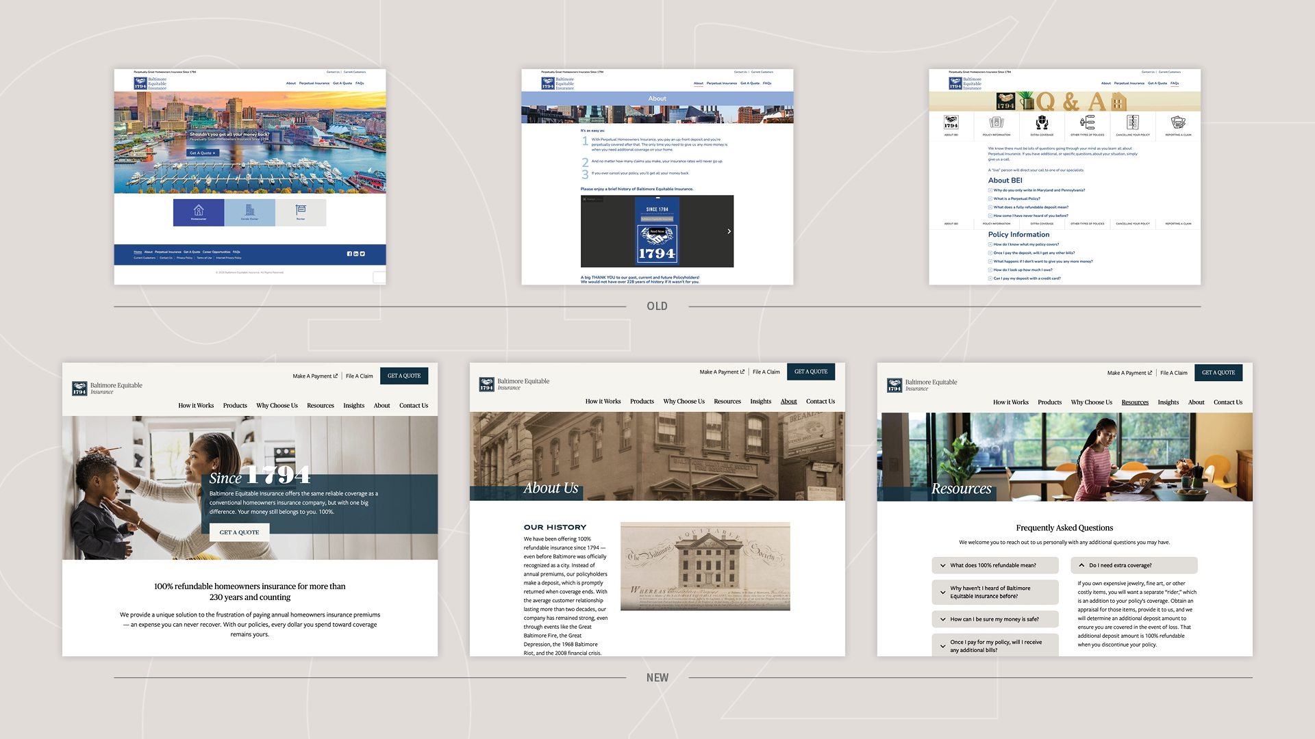
Website: The website followed the same disciplined path as the brand: discovery, a sitemap, wireframes, high-fidelity mockups, and a live development environment for the client to review. The site launched at 1794insurance.com.
Its structure is built around one goal, which is to make the model easy to understand. A How It Works section, a side-by-side comparison with traditional insurance, a plain-language FAQ and glossary, and a downloadable guide to homeowners insurance answer the questions prospective policyholders were asking by phone. Every path on the site leads to a quote request.
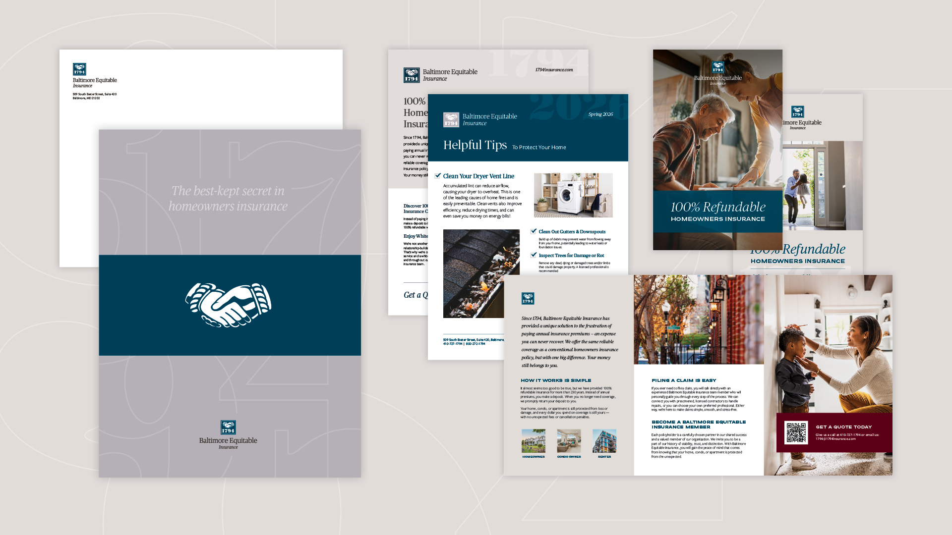
Collateral and Sales Materials: We applied the new identity to a complete stationery and sales system, including a pocket folder, letterhead, business cards, a product overview brochure, a what-to-expect sheet for the inspection process, and a dedicated one-pager and brochure for independent agents, a channel for which the sales team previously had no materials.
To introduce the brand internally, we designed a gift box that was presented to board members at their annual dinner.
Throughout the project, communication was open and quick. The client’s point of contact prioritized our requests, feedback stayed at the level of refinement rather than redirection, and the client was comfortable telling us no when it mattered, which made our recommendations land better when it counted.
The new brand was met with enthusiasm across the company. In the client’s words, it finally feels like them, and it elevates their image to match the quality of the service and products they offer. The more refined look and clearer message lend credibility to a product that many people initially assume is too good to be true, and they place a company with more than 230 years of history on equal footing with national competitors.
The website launched in mid-May 2026. In its first four and a half months, through the end of September:
The engagement has continued past launch. Orange Element now manages Baltimore Equitable Insurance’s ongoing marketing, which includes a monthly leadership dashboard, delivered under the 1794 Insurance brand, covering website, reputation, and social performance, an SEO-led content program built around the questions prospective policyholders search for, an organic social launch across Facebook and LinkedIn, and a refreshed sales toolkit for the direct and independent-agent channels.
Organic social went live in September and earned 2,088 impressions from 18 posts in its first month, with LinkedIn driving most of the reach. A trusted partnership formed over the course of the rebrand, and the client continues to look to Orange Element for its next step.
The project included a refreshed brand identity built around the company’s historic 1794 fire mark, new typography and color, a foundational messaging framework organized around six brand themes, a complete print and digital collateral system, sales materials for the direct and independent-agent channels, a board gift box, and a new website designed and developed by Orange Element.
Perpetual insurance is an industry term that most homeowners do not recognize. 100% refundable describes the same product in the customer’s own language: instead of annual premiums, the policyholder makes a deposit that is returned in full when coverage ends. Leading with the benefit made the model easier to understand and easier to sell.
In its first four and a half months, from mid-May through September 2026, the site drew 3,241 visitors and 4,301 visits with a 48% engagement rate. September was the strongest month since launch. Organic search delivers roughly one in three visitors, who engage at nearly double the site-wide rate, and the Get a Quote page drew 299 visitors averaging 1:24 on the page.
Yes. Orange Element is a Baltimore branding and marketing agency that works with insurance, financial services, and other regulated industries, including Baltimore Equitable Insurance, Keller-Brown Insurance Services, OneMain Financial, and First Home Mortgage.
For a company with more than 230 years of history, the challenge is honoring our heritage while continuing to evolve. Orange Element struck that balance perfectly, creating a modern brand that reflects both our rich history and our future. From their very first presentation, we knew we had found the perfect creative partner for our unique business.