Services
- Small Business Branding
- Brand Identity Development
- Brand Strategy
- Messaging Guide Development
- Brand Guidelines
- Competitive Analysis
- Brand Advisory & Implementation Support
Maryland Primary Care Physicians (MPCP) has spent nearly three decades doing something many healthcare organizations aspire to, but few sustain: building lasting relationships with patients across generations. With more than 230,000 patients and 10 locations, MPCP isn’t just a provider – it’s a constant in the lives of families navigating everything from first checkups to chronic care.
In healthcare, trust is earned over time. But in a digital-first world, it’s also first judged in seconds. That created a simple but important question: does the organization’s presence reflect the reality of its care?
With new leadership and a milestone anniversary on the horizon, MPCP saw an opportunity to ensure the answer was yes. The resulting work would later earn industry recognition for both the brand refresh and digital experience.
The diagnosis was straightforward. An outdated brand and a cumbersome website were quietly working against the organization.
Patients encountered friction where there should have been ease – finding services, navigating content, scheduling care. Meanwhile, the brand itself undersold the depth, scale, and humanity of the care being delivered every day.
Individually, these are common problems. Together, they create a quiet but meaningful disconnect: an organization that feels better in person than it does online. And in modern healthcare, that gap doesn’t stay quiet for long.

Orange Element approached the work the way any good clinician might: in phases, with a clear plan and steady communication.
The engagement began with healthcare brand strategy, clarifying how MPCP should show up for patients across generations. The goal wasn’t reinvention, but alignment – capturing the consistency, accessibility, and long-term trust that define the organization.
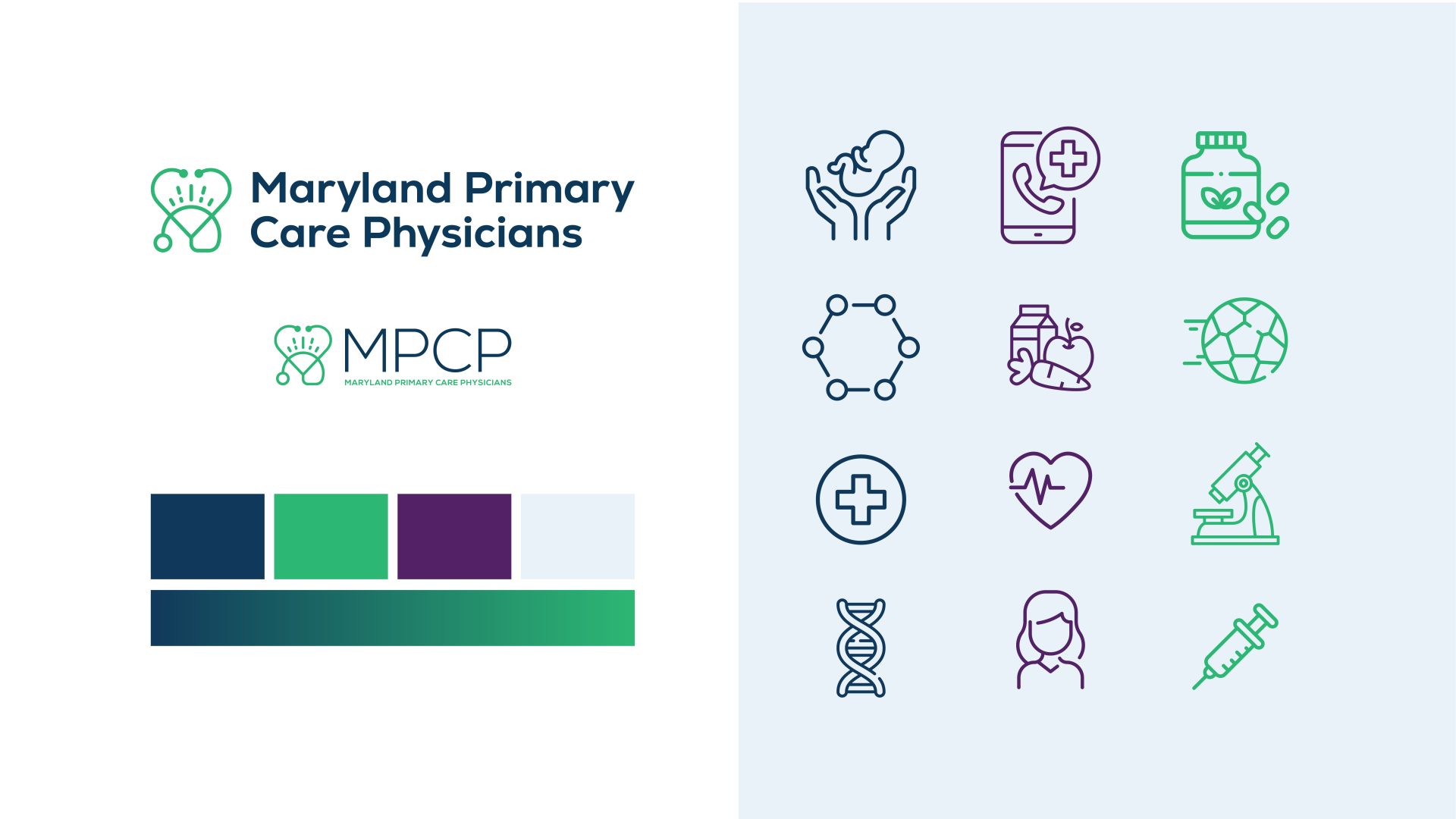
That thinking shaped a modernized identity: logo, color palette, and typography designed to feel current without chasing trends (because nothing dates faster than what’s “current”). More importantly, it created a system that could scale consistently across every touchpoint.
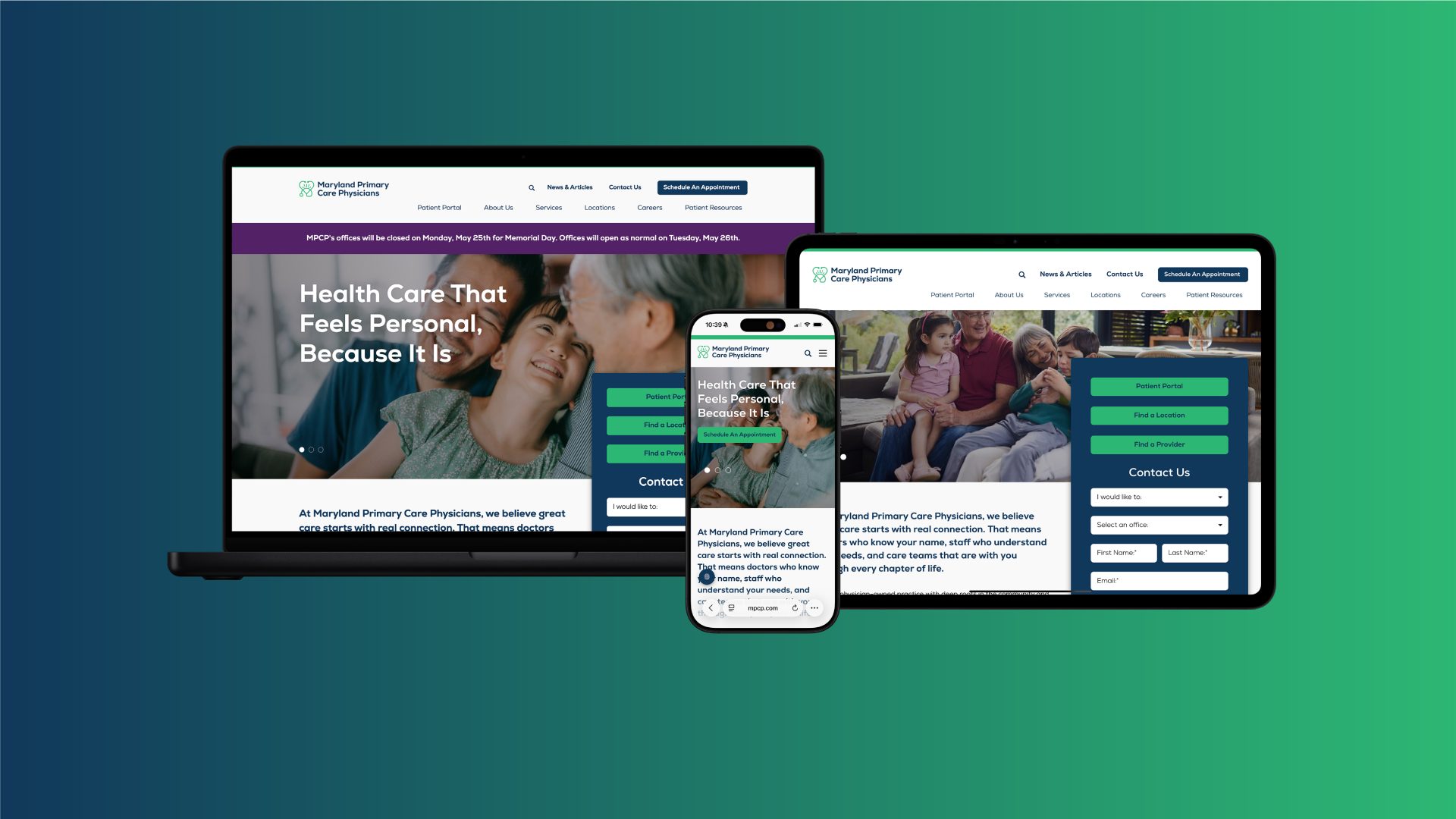
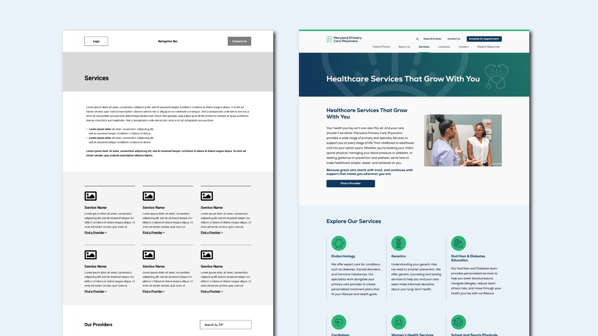
With that foundation in place, the website became what it should be: proof. The team led a healthcare website redesign grounded in UX best practices, simplifying navigation, restructuring content, and creating clearer pathways for patients to take action. Finding a provider, understanding services, scheduling care – each interaction was designed to feel less like work and more like progress.
Just as critical was how the work got done. Through weekly walkthroughs, iterative reviews, and open dialogue, stakeholders were brought into the process rather than asked to react to it. In an environment where approvals can easily stall momentum, this approach kept decisions moving – and ensured the final product reflected true alignment, not just consensus.
The outcome isn’t just a better website or a cleaner brand – it’s alignment.
Patients now encounter a digital experience that feels as thoughtful as the care itself: easier to navigate, easier to trust, and easier to act on. Internally, MPCP has a platform and identity that are simpler to manage and more consistent to apply.
The brand now reflects the organization instead of shrinking it. The website supports rather than slows. And together, they finally match the care that has always been there.
That alignment did not go unnoticed. The work was later recognized with three 2026 Distinction awards from the Communicator Awards for website redesign and brand refresh.
Specialized partners were brought in to support execution: