Services
- Identity
Developing a strong identity that aligns with the evolving makerspace industry, while honoring the rich history of manufacturing in Baltimore.
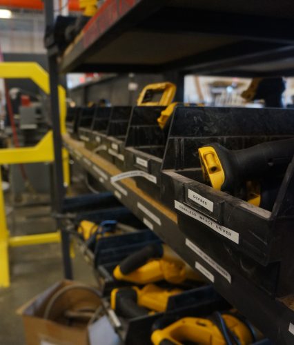
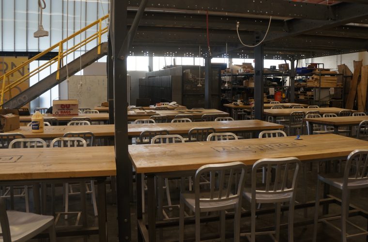
Nonprofit makerspace the Foundery originally opened its doors in 2013 with a 4,000-square-foot creative space full of power tools and welding gear. Its relocation three years later to a 20,000-square-foot space in City Garage in Port Covington allowed them expand their services to include 3D printers and lasers, wood and metal fabrication equipment, welding and hot work, and more industrial-grade power tools. With this expansion, the Foundery sought to improve the look of its brand to match the look of its space. So they called us.
The Foundery wanted a new logo that fits their new modern space, honors the manufacturing industry and represents the forward-thinking mission of the organization — to give Baltimore’s creative makers a place to gather, learn, build and teach.
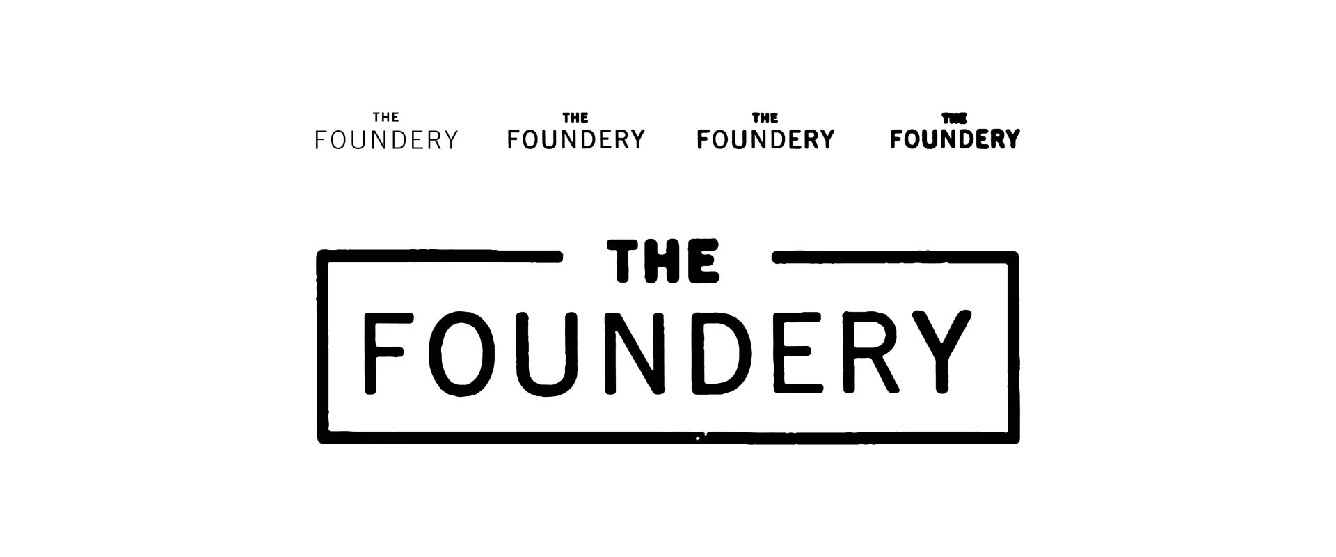
With a space intended to foster a new trade industry movement for the 21st century, the logo had to take inspiration from the rich manufacturing history of Baltimore. We studied everything from painted typography and signs on brick across the city, to labeling, engraving and maker’s marks on old tools and machinery. What we found was a beautiful, utilitarian simplicity in typography that we sought to replicate. We manipulated typography to simulate age and years of use, and show the subtle imperfections that make older labels and logos so authentic. With a simple, modern color palette, The Foundery logo became the perfect blend of new and old, a maker’s mark intended to fit right in with the tools and machinery of the space.
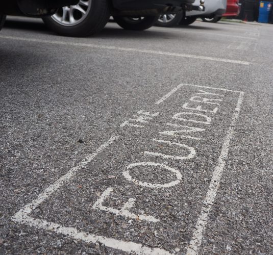
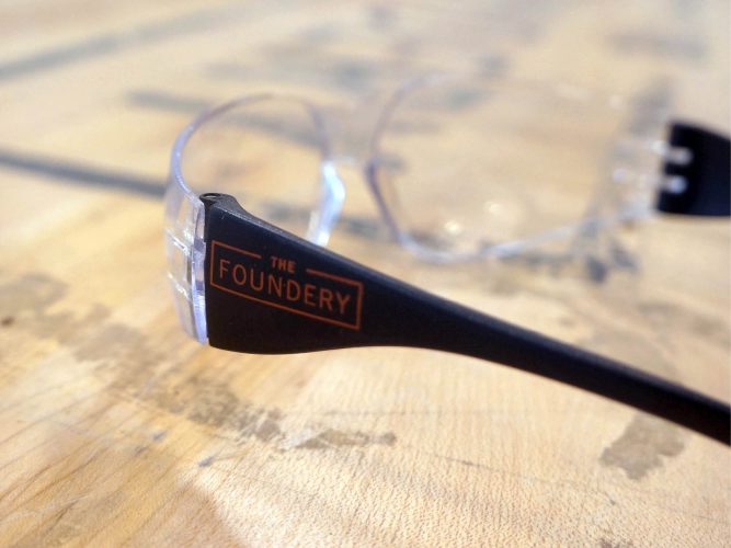
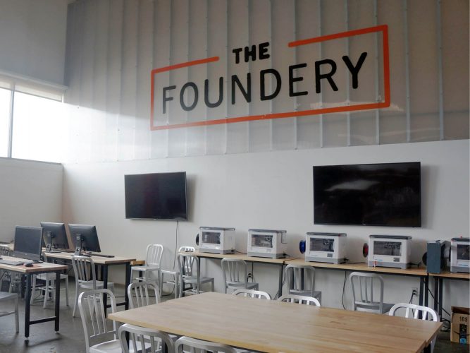
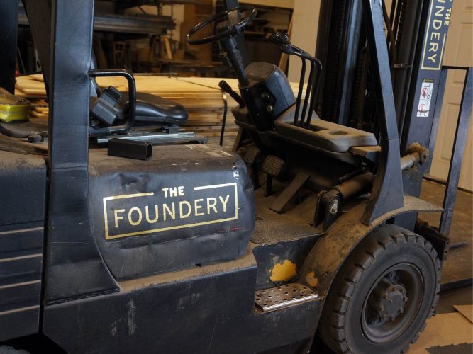
You’ll find the new logo plastered over The Foundery’s apparel, website and on the walls of their shop like a proud stamp of approval. The organization is pleased to have a strong brand identity that exemplifies the energy, creativity and tradition of the industry it represents.


