Services
- Discovery and immersion
- Situation analysis
- Brand assessment
- Messaging
- Logo and identity
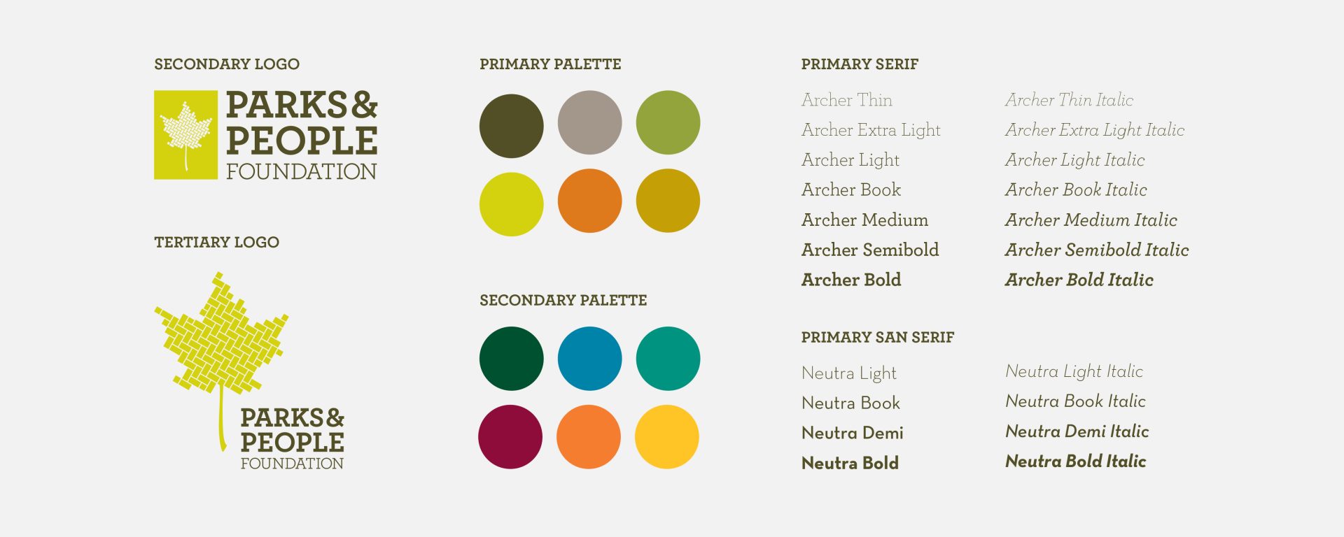
- Style guide
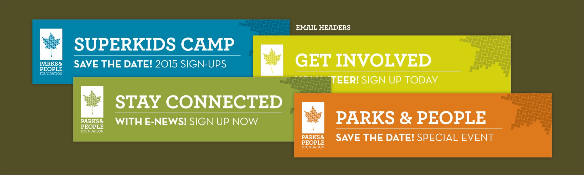
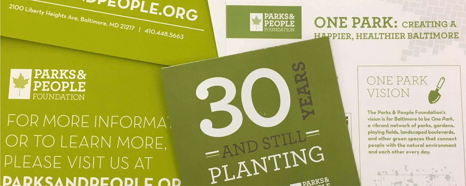
- Collateral
Creating a new brand to match the growing importance of its mission to connect Baltimore’s parks and community.
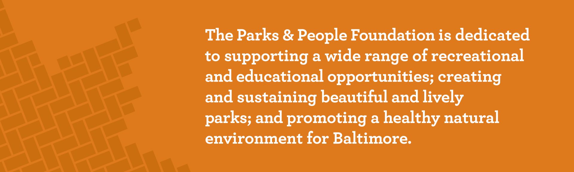
The Parks and People Foundation supports programming in Baltimore City for families and children that allows park clean up and program activation, which all leads to an opportunity for children to learn leadership skills and teamwork. After almost 30 years in service, the nonprofit wanted to refresh their brand and sought Orange Element’s help creating an updated and authentic identity to carry its mission forward.
As with most nonprofits, differentiating an identity from other like-minded groups is challenging. There are many similar organizations in Baltimore, like Parks and Recreation and Baltimore Tree Trust, so developing a new logo and brand that stood out was important. After all, Parks and People’s focus is equal parts in our children’s future and the greening of our city’s natural spaces—it’s not just an environmental organization.
During logo development, our team deliberated the best way to represent both the environmental aspect of the organization along with the people inhabiting it. That’s how the leaf built buy bricks was conceived: the bricks represent the city coming together to build up a healthy and beautiful space to live and grow. The design also represents a foundation built “brick by brick,” while encompassing the energy of Baltimore’s old-city streets.
The complete identity system, messaging guidelines, style guide and marketing collateral all allowed Parks and People to grow and expand its mission, while establishing a recognizable brand in the community.