Why Companies Rebrand
Embarking on a rebranding effort is a significant step for a business—one that doesn’t come without its risks and challenges. Over the past decade, we’ve seen some really great rebrands and ones that haven’t delivered. A rebrand can be as extensive as a complete overhaul of the identity, messaging, and image or as small as a refinement to one element. It’s important to note that a rebrand, regardless of extent, is something that needs to be thoughtfully strategized and executed. Without the proper planning and execution, a brand can miss the mark.
A rebrand can be a proactive or reactive measure for an organization. Proactive rebrands are typically due to predicted growth, offering a new line of business, entering a new market, reaching a new audience, or staying relevant. Reactive rebranding typically happens after a merger or acquisition, being confronted with legal issues, feeling competitive influence, and receiving negative publicity. We want to share our favorite and least favorite rebrands of the decade.
Our Favorite Rebrands
Chobani (2017)
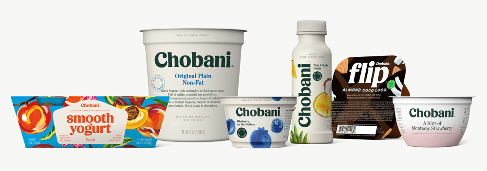
Chobani launched in 2007 and their 2017 rebrand was done by their in-house team and led by Leland Maschmeyer. The previous logo was very geometric and sharp, with a sort of art deco feel, leaving a somewhat cold impression. The new mark embraces soft serifs, and chubby, curved letterforms, and title case typesetting, which makes sense considering it’s representing yogurt (smooth, creamy, etc.). The rebrand also included a new suite of colors that really evoke a perception of a product that is wholeness, natural, and good for overall wellness. Their color scheme includes forest green, raspberry, and chocolate and are showcased in little “scribbly” icons that coincide with the “from nature”, wholesome feel. Chobani also overhauled their photography, too, that is very food-first and focuses on fruits.
The whole rebrand is earthy in a really great way that coincides with the kind of storytelling you might not know you wanted from your yogurt brand. Their new packaging is simple and clean, with an off-white base color, crisp typesetting, and a “new look same yogurt” seal. Overall it feels like a shift towards a health food brand (“food is a force for good”) vs solely greek yogurt. Additionally, they offered new products to their family including “flip” yogurts and drinkable yogurt.
– Megan Gileza, Senior UX Designer
Toronto Raptors (2014)
Beginning with the “We the North” campaign in 2014, the Toronto Raptors began their transition into a new era and attitude that maintains true to the team’s history. Transitioning from a previously 90s-esque aesthetics that they’ve held since their founding, the Toronto Raptors’ rebrand took them from a laughingstock to a symbol capable of representing an entire nation. Their new logo and messaging embraces their unique position of being the only non-American NBA team. In addition, their new signage is strong and simple enough to stand out in streetwear, apparel, and social media.
– Kent Ng, Animator
Mailchimp (2018)
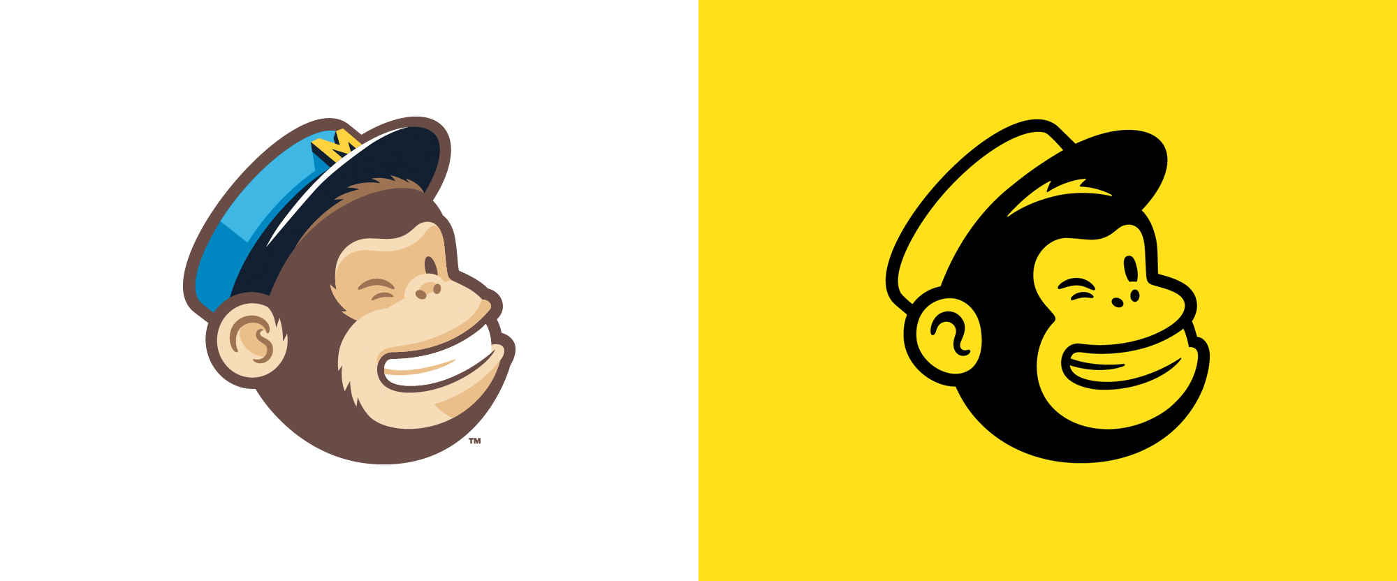
Originally branded in 2001, COLLINS and the Mailchimp in-house team came together for a rebrand in 2018. The previous logo script and monkey logomark (Freddie) had hierarchy issues (the Freddie mark was a much heavier line weight than the light/airy logo script), so they couldn’t be displayed together. For the 2018 rebrand, they ditched the logo script and created a balanced lockup by pairing Freddie with a heavy, modern typeface.
To build a recognizable and memorable brand voice across all platforms, the rebrand utilizes a signature color, Cavendish Yellow. Cooper Light is the new brand typeface — it is very versatile and represents the best of both worlds, since “it can be dressed-up and editorial or casual and approachable.” The main brand elements are supported by a fun, whimsical, handdrawn illustrations to add a unique human touch to the Mailchimp platform. I was a big fan of the original logo script, so I was sad to see it go, but this brand refinement and extension will help Mailchimp grow and become more widely recognized.
– Rachel Ventura, Graphic Designer
Mastercard (2016/2019)
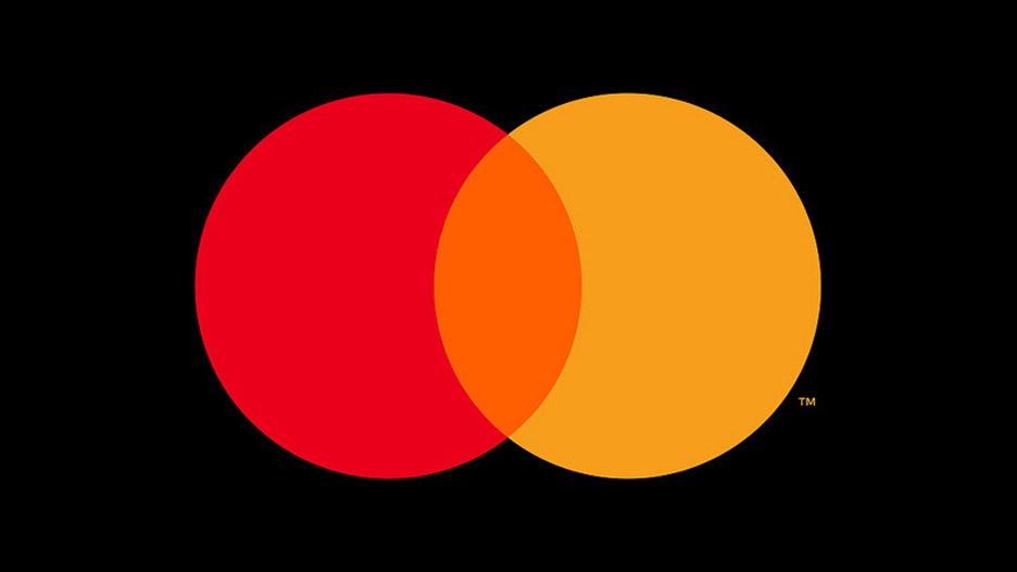
In its first rebrand in twenty years, Mastercard enlisted Pentagram to enhance its identity in 2016 and bring it into the modern digital age. After first optimizing the recognizable red and yellow, cleaning up the “90’s stripes” and making the bold move to go with all lowercase typography in 2016, Pentagram applied a final touch in 2019. After studies showed over 75% of people recognized the brand by only its iconic circles, Mastercard dropped their name and joined the likes of Nike and Apple in the upper echelon of “nameless” consumer brands.
Over the years, Mastercard has stayed true to their recognizable identity: the interlocking red and yellow circles. A rebrand doesn’t have to be a complete 180 from where a brand was previously. In fact, it often serves a brand well to understand how small changes can make a big difference without completely erasing the history of the brand. Some of the least successful rebrands are ones that completely do away with elements that have resonated with customers over time.
– Andy Bonner, Design Director
Our Least Favorite Rebrands
Burberry (2017)
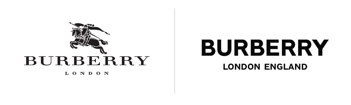
This rebrand has widely been considered a somewhat successful attempt at setting Burberry up to position the iconic brand for what comes next in their story. I’m likely in the minority but believe the new elements, especially the logo typeface, leave it lifeless, trendy and generic. The new logo, designed by Peter Saville, completely does away with the knight emblem and elegant serif type that represented the brand for decades. Far too many brands are simply choosing a clean, safe font. For a brand that carries such history, there could have been a study and identity system developed to carry forward great soul and still pay homage to brand provenance.
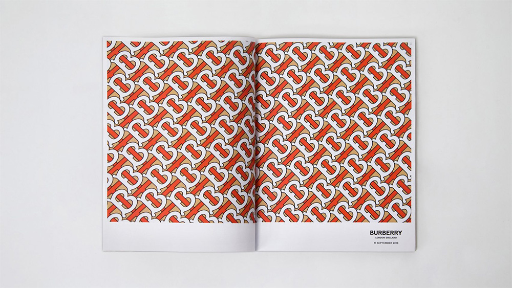
On top of the logo leaving more to be desired for, the monogram pattern has good intentions. The interlocking B’s and T’s stand for the brand’s founder, Thomas Burberry, but comes off a bit cartoon-ish, a complete divergence from Burberry’s classic and sharp image from before. It’s clear that this rebrand was an attempt to bridge the gap between the brand’s history and their desire to appeal to younger generations, but I can’t help but feel like Burberry lost something in this transition.
– Aaron Moore, Principal
Weight Watchers (2018)
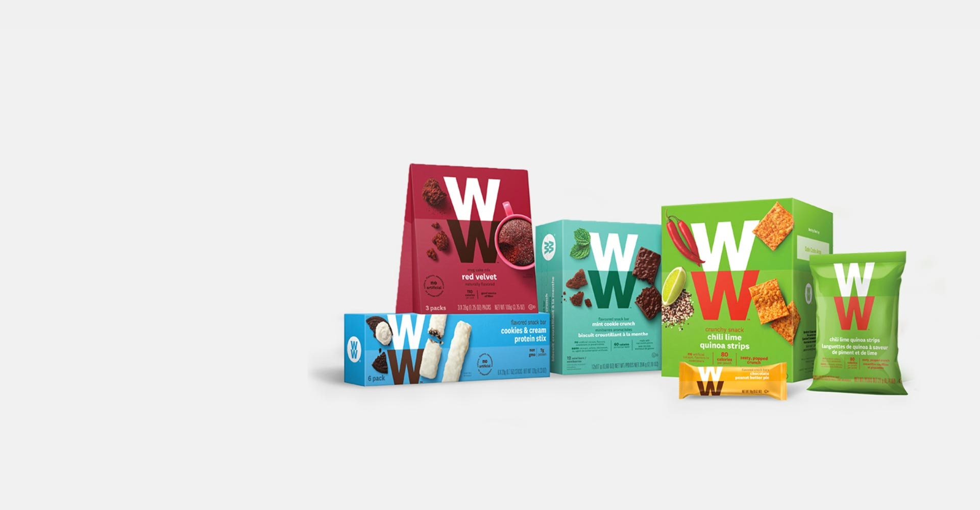
In a bid to keep up with the latest health trends that prove less of an obsession with weight and more with wellness, Weight Watchers embarked on a rebrand that launched in 2018. Strategically, making a transition to wellness made sense as our culture has become increasingly intolerant of pressure to look a certain way, but unfortunately they hit the mark. Weight Watchers, now renamed WW, failed to generate awareness of the name change before the rebrand and continued to falter with unclear messaging, confusing advertising, and an unfocused campaign overall.
WW’s stock plummeted 34% after a reportedly bad Q4 and post-holiday period when people tend to be the most health-conscious. On top of lack of awareness and weak messaging, WW has suffered from lack of recognition. They pivoted away from their brand, name, and purpose, that so many people trusted and recognized for over 50 years. Most people didn’t even realize WW was Weight Watchers since they seemed to be target and entirely different market than before. Not to mention, who is actually going to say “Double U Double U” out loud?
– Kia Jackson, Copywriter
Gap (2010)
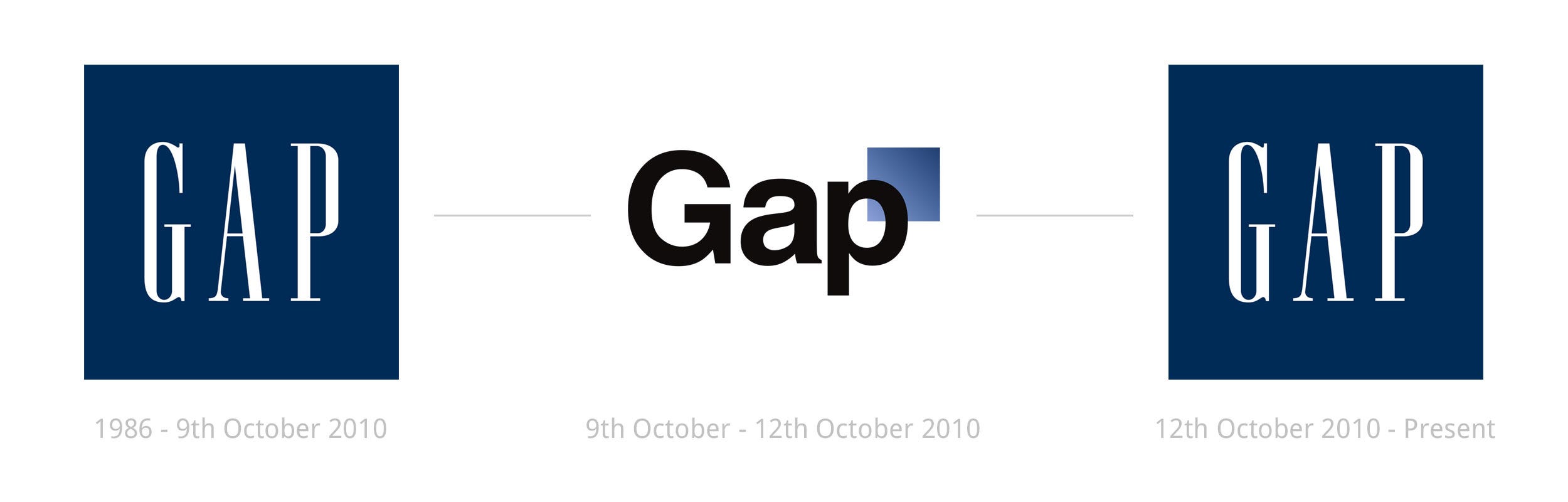
Gap’s rebrand in 2010 lasted less than a week after receiving terrible backlash and outcry from people online. Gap even enlisted help from the public for what they think the new logo should look like… to which most responded with memes and parodied logos. Not to mention, asking the public for designs for free isn’t the best road to go down if you want to maintain any kind of dignity your brand has left. Another reason why this change was so ill-advised was because it came without warning and without a connection to a new product offering and messaging. Changing a logo isn’t going to carry customers through a transition without some kind of explanation.
The logo in itself is boring and tacky, combining a 73-year-0ld typeface with an oddly-placed blue square (with gradient nonetheless) that acts as a lame reminder of what the brand once was. It’s important to understand what equity your current brand image has and respecting that before going in a completely different direction. Sometimes it can work, but as we’ve seen from Gap’s 2010 blunder, it can be a huge set back.
– Madison Lawrence, Marketing Strategist
Our Takeaway
Visual style in a rebrand is obviously important, but the strategy and marketing behind a rebrand could make or break how it’s accepted by your audience. You can have a beautiful identity, but if it doesn’t make sense for the story your brand is trying to tell or doesn’t tie in with what your company offers, customers may be reluctant to embrace it.


