Services
- Discovery & Immersion
- Web Design
- Identity Redesign
- Web Development
Introducing a new brand identity for a 20-year-old software firm
QC Ally applies technology-based solutions to ensure regulatory compliance for mortgage lenders. Quality control services allow lenders to ensure that each step of their mortgage processing meets the standards mandated by regulatory bodies. QC Ally assists management in keeping track of the many mortgage processes, and it also aids in evaluating the processes’ integrity by providing appropriate feedback.
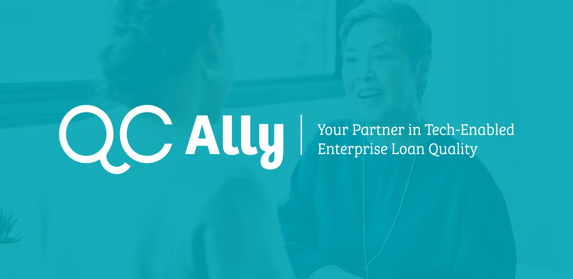
After 20 years in business, Inco-Check faced a difficult reality. Their flagship product — QC Ally — had made more of a name for itself than the company had. When company leadership decided to change the name, QC Ally was a clear choice. The new name better reflected their quality control services and spoke to the company’s caring culture and exceptional client focus. The name change led to an opportunity to reinvent their brand, first with a new logo and next with a revitalized website.
Logo design tends to follow one of two paths: a typography treatment (words only, like Google or Coca-Cola) or a graphic treatment (like the Twitter bird or the Target bullseye). In this case, the approach was based on typography but with a clever twist.
Notice how the Q and C are placed side-by-side to look like eyeglasses, with the tail of the Q curving under to make the shape of a nose. We added character, literally and figuratively, that captured how QC Ally wanted to be perceived: friendly, approachable, knowledgeable and experts in their industry. This human element balances functions that make some people squirm: audits, compliance and regulations. QC Ally wants their audience to know that caring and conscientious people are behind the software and the analysis.
These types of logos excite viewers when that second layer of meaning clicks in their minds. They have a special connection with the product or service when they sense something deeper. Have you ever noticed that the Amazon arrow is also a smile?
“Our company name is clearer, our brand is more vibrant, and our messaging is on-point. With such a robust brand identity, people now know who we are,” said Nicole Booth, CEO.
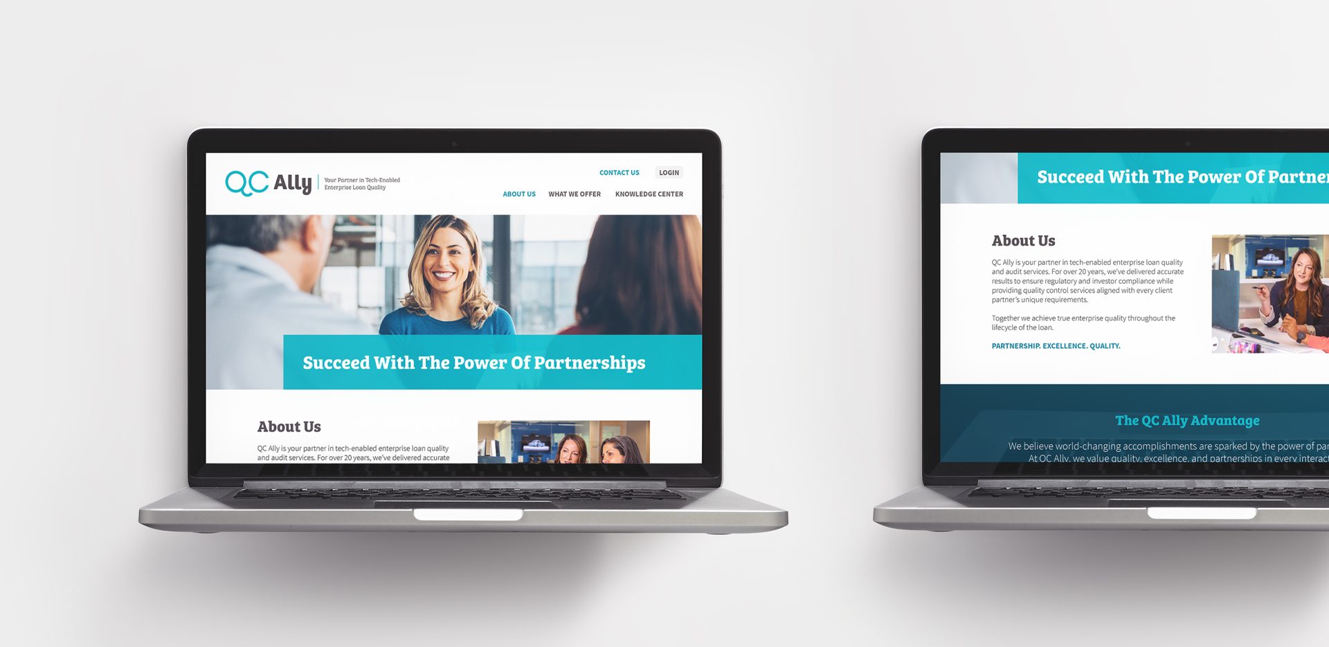
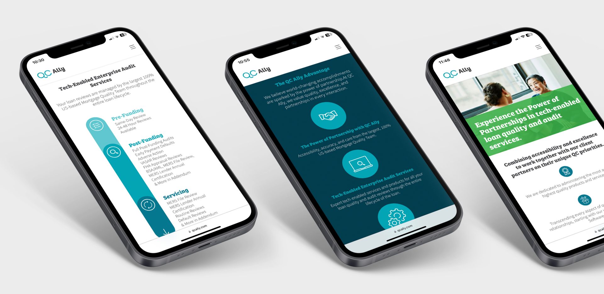
The logo creation easily led to the expansion of their visual branding, which we applied to the design and development of a revitalized website. An upcoming industry conference would be the ideal time to unveil their new name and logo to the world. We created a Stage 1 pilot website for them to share at the conference and build excitement for Stage 2.
With Stage 2, we added elements and functionality that would allow them to take full advantage of website-based marketing possibilities, like publishing blog posts, hosting webinars, and posting press releases. Their website now provides a home for these opportunities to communicate with their customers. With a name and logo that captures their brand, they are excited to initiate these conversations.
Our partnership with Orange Element has been spectacular. They took the time to dive into our 20-year legacy and understand the essence of who we are. After our in-depth conversations, their approach and rollout strategy to the company’s rebrand was thoughtful and impactful. Client service was excellent, and the team was able to handle the ebb and flow of activity with a sense of urgency. We are so pleased with how seamless the transition was, and our team has been so excited to rep the new brand!