Services
- Discovery & Immersion
- User Research Studies
- User Experience Design
- Web Design
- Development (WordPress)
The massive, god-forsaken dropdown menu on the Johns Hopkins Nursing Magazine website is something about which we’d heard numerous complaints over the course of our work with the School of Nursing team. We weren’t too fond of it ourselves. But the unmanageable menu was just one indicator of a larger issue: that the growing purposes, content types, and audiences of the website had outgrown the years-old design and structure of their existing site. It’s something we’d experienced firsthand in publishing the print and digital versions of their semi-annual magazine. So when the Johns Hopkins School of Nursing asked us to tackle the redesign of their website, we were thrilled.

While we had our own ideas about where and how to improve the Nursing Magazine website, there were some other people we needed to ask: the users. Before diving into the redesign, we spent some time analyzing their metrics and conducting both quantitative surveys and qualitative interviews with users across the magazine’s audiences. We talked to faculty, staff, students, and alumni to find out what users value in regards to their relationship with the school of nursing, and how the website can support that; where the strengths and weaknesses of the current site lie, and how we can reinforce and redesign those things respectively; and how we might present usable functionality and content based on what users actually want to experience and read.
While we knew the website would need to “check a lot of boxes,” so to speak, based on our research we arrived at four foundational objectives for the redesign that would enhance user experience (UX) and meet both internal and external needs:
1. Showcase the school community—its voice, diversity, and expertise, with an eye towards what’s topical within the community at large
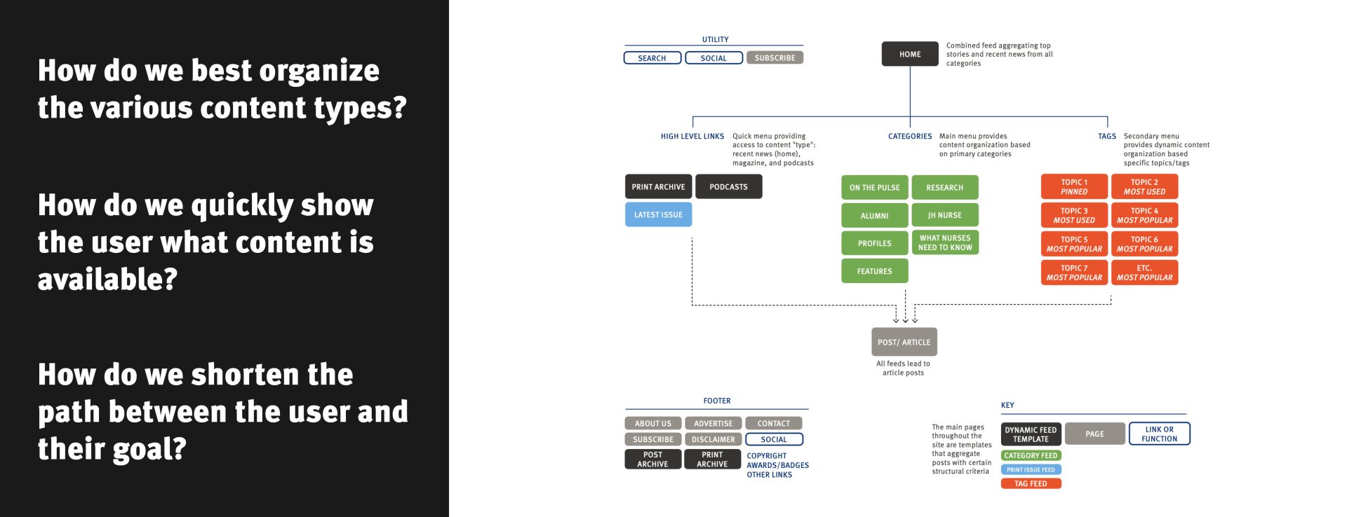
2. Establish streamlined, user-friendly site organization and navigation that displays all content types clearly (including recently-launched podcast series)
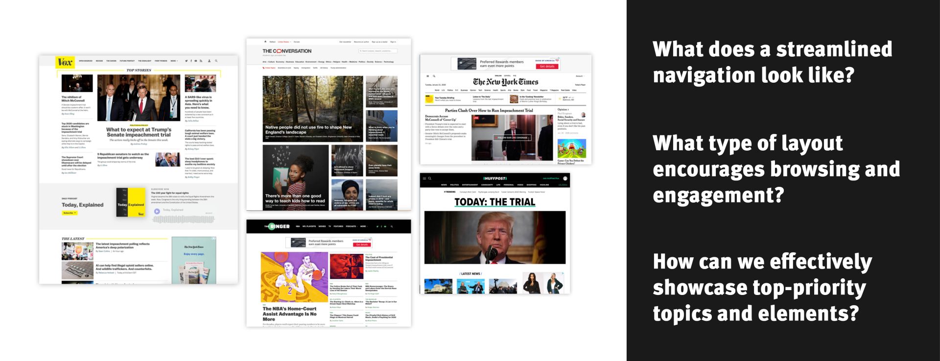
3. Implement page designs that prioritize quality content and encourage browsing and engagement, akin to a contemporary news outlet website
4. Explore opportunities to increase visibility of the site and its content
In addition to addressing the needs identified by our user research, we also needed to create a system that could accommodate a growing amount of content and evolving definition of “relevant” topics. The new structure needed to seamlessly integrate semi-annual content from the print magazine with day-to-day blog posts as well as the school’s expanding podcast series.

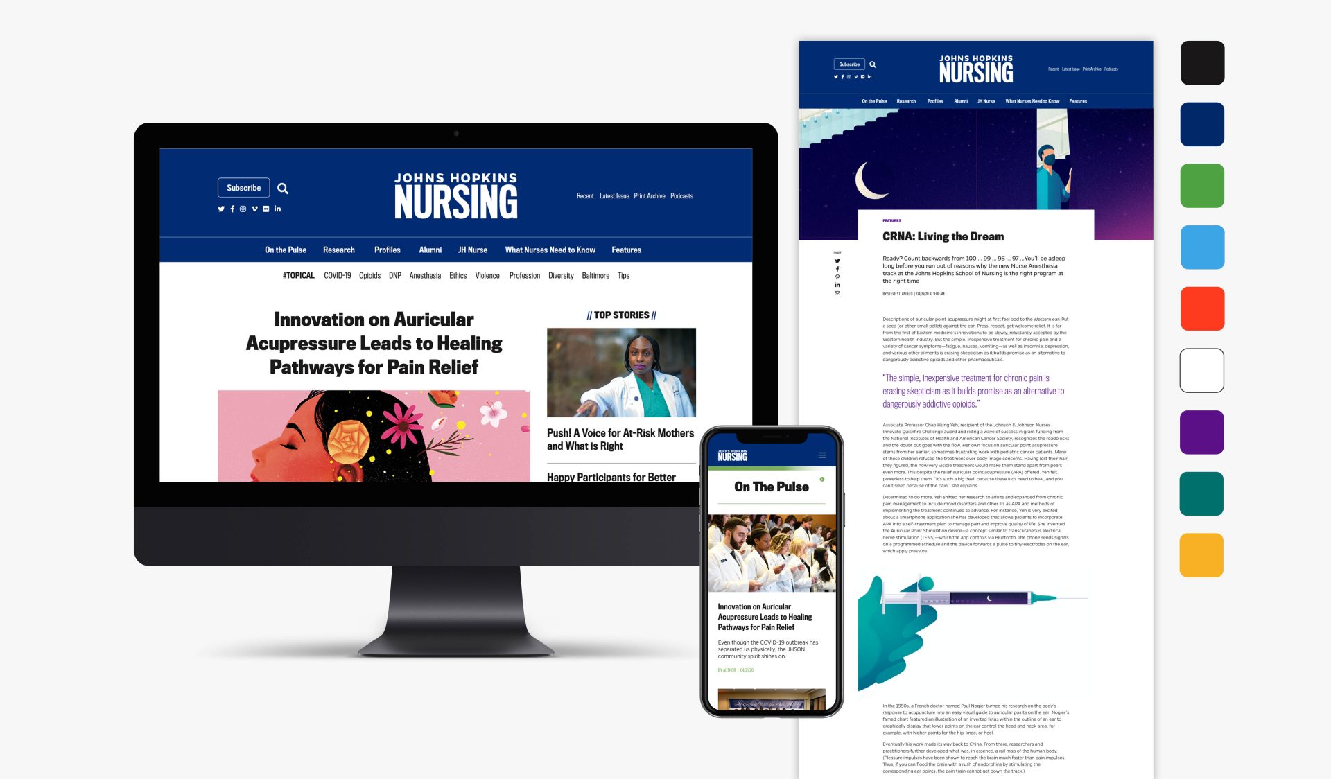
Gone are the days of the cumbersome dropdown menu. What was once a menu that, upon hover, consumed half the page with a list of every back issue of the magazine is now a simplified navigation system broken down into three parts: interaction (social media, subscriptions, and search); content types (recent posts, print content, and podcasts); and topics. Even better, rather than naming menu items with internal or outdated conventions, we reorganized the main category system to reflect meaningful, user-focused topics such as “alumni” and “what nurses need to know.” In addition, we introduce a dynamic secondary menu that can be easily and continually updated to position hot topics at readers’ fingertips.
Whereas the old version of the site divided the homepage by category (ex: a section for alumni content, a section for hospital content, etc.), we drew inspiration from news websites and aggregated content from all categories into a single main feed with a clear hierarchical system. Users can then refine their browsing experience by visiting topic-specific feeds as designated by the new and improved navigational system.

Specific content types, such as content from the print magazine and the podcast series, received custom templates to enhance optimize their respective browsing experiences.
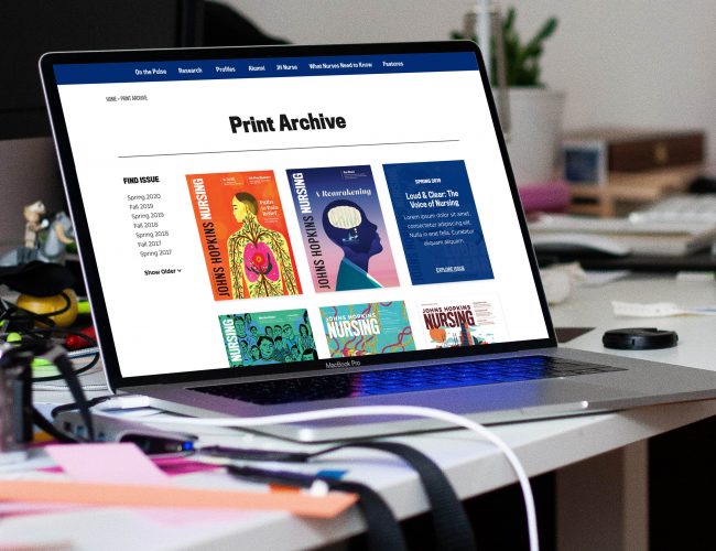
The print component of the magazine, while still integrated into the website through features such as a Latest Issue sidebar section, is given prominence through treatment as a distinct content type. Thus, the archive of past print issues now lives in a tidy archive with easy-to-skim thumbnails of the cover art.
Similarly, a featured podcast is propped up in the sidebar of the homepage, while the full podcast archive is housed on a single Podcasts page where a viewer can easily access and dive deeper into each particular.
On the backend, we performed a series of updates and optimizations to dramatically increase the speed of the site—a major pre-redesign pain point. We also streamlined the process for generating magazine issues (via an intuitive custom post type), organizing important posts across the site (using an efficient system of tags), and laying out individual posts (through the native WordPress editor rather than an outdated plugin)—features that we’ll appreciate ourselves as we work on the next magazine issue for Fall 2020.
Explore the project at magazine.nursing.jhu.edu.

