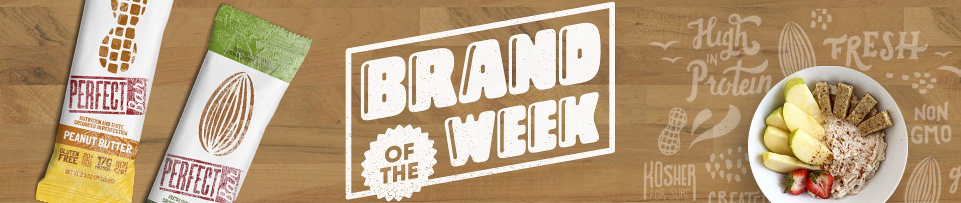
While most people claim “there’s no such thing as perfect,” the Keith family begs to differ: they have created Perfect Bar from their father’s recipe, which is now sold in stores nationwide. The refrigerated protein bar is tasty, all-natural, and comes in a variety of flavors like dark chocolate chip peanut butter and blueberry cashew. Our creative team analyzed its packaging, website and overall brand presence in our latest Brand of the Week. Some of our recommendations are below.
“Make no mistake, Perfect Bar is delicious! However, when one of our team members went to go buy one, he wasn’t clear on where to find it. A great solution to consider would be point-of-sale signage in the energy bar aisle, directing customers to the refrigerator case. It could even be used as a benefit: customers might ask ‘Why aren’t any of these other bars refrigerated—are they not as fresh?’” – Andy
“Perfect Bar’s website and social media presence is appealing and clean, but there is an opportunity to focus more on the consumer and end-use. Is the bar a good meal replacement? Is it good for dieters? Is it a good pre-workout snack? Will kids love it? As a new customer, I’m not familiar with the benefits for me based on their marketing. Campaigns directed toward specific consumers, like athletes, moms, and busy students, could generate more awareness and personalization for the product.” – Hannah
“The Perfect Bar blog has a ton of great posts that cover a wide array of topics. I really enjoy how their blog covers not only their product, but also topics that fit within the Perfect Bar lifestyle that their brand represents. The one thing I struggled with on their blog was the way they are dividing up their content. You don’t really know what the different sections are until you click into the sub-navigation. I think there are ways to improve the blog’s UX so that the users can find the kind of content they are looking for more quickly and easily.” – Kendall
“Overall, the packaging is strong and I like the use of color to differentiate the various flavors. I do question, however, if the window in the packaging is working or helping. The Perfect Bars we sampled, while delicious, appeared visually similar across flavors and not bold enough to stand out from each other behind the windows. In comparison, a brand like Kind Bar uses the window to effectively show off their flavorful bars and all of the ingredients. I think an easy solution would be to do an idealized illustration of the bar in that same area of the packaging. Or, I would swap out the peanut and almond window shapes and play up the smaller ingredient illustrations.” –Kenny, guest contributor
“The thing that gets me so excited about Perfect Bar are all of the organic and super food ingredients. If you are holding a bar in your hand — I’m holding my favorite, Dark Chocolate Chip Peanut Butter—take a look at the ingredients and you’ll see a mile long list including everything from Organic Flax Seed Oil to Organic Kelp. Even though the packaging makes it clear that the bar is made with 20+ Super Foods, as a consumer I’d like to know more. While the Keith family story is endearing, it’s using up valuable space on the packaging (and throughout other materials). There may be opportunity in propping up the ingredients as the true star of the show to appeal to the growing healthy-lifestyle market and letting the story become secondary.” – Nicolette
Check out all of our Brand of the Week posts here.


